路嘉锋/Jiafeng Lu
Oppenheimer Capital Canvas
UI Kits
Oppenheimer is a financial company focused on brokerage and investment banking.
Oppenheimer's Design system improves the financial property website's efficiency and professionalism. The team maintained the brand identity and developed a new, user-friendly product
Client:
Oppenheimer.com
Tools:
Figma, ZeroHeights
Team:
Xinru Wen, Scott Dunay and Jiafeng Lu
Date:
Oct 2023-Dec 2023

My role:
Making UI Kits Design Decisions and rules, creating styles of UI Kits, outlining structures, and writing for documentation and presentation.

Design:
Created UI inventory; Standardized Colors, Aspect Ratio and Layout; wrote the overview, style, and resources sections of the documentation

Why Oppenheimer needs UI kits?
Consistency and Branding:
A UI kit helps make sure that everything on the website looks like it belongs to Oppenheimer. It uniforms the design.
Efficiency and Scalability:
Using a UI kit makes it easier and faster to build and update the website.
Improved User Experience:
A UI kit makes the website easier to use. This is especially important for a financial website, where information can be complex.
Our design team developed a coherent, straightforward, and recognizable design system aimed at supporting designers, product managers, and engineers in enhancing the user experience for Oppenheimer.com.
Improved Experience
Consistent and Intuitive Navigation:
A design system establishes consistent patterns for navigation and layout. This consistency makes it easier for users to find what they're looking for, as they quickly become familiar with how the website works.
Cohesive Visual Language:
It unifies the visual elements (like colors, typography, image sizes and icons) across the website. This cohesiveness not only reinforces the brand identity but also creates a more pleasant and less confusing browsing experience. Which benefits both designers and engineers as well.
Responsive and Accessible Design:
A good design system includes principles for responsive design, ensuring the website is easily navigable and visually appealing on any device. It also emphasizes accessibility, making sure the website is usable for people with disabilities, which broadens its usability and inclusivity.
To create a unified and standardized system, we implemented the fllowing steps of creating a design system.
Inventory
UI Kits
Documentation
We Deconstruct the UI Inventory
Catalogue components
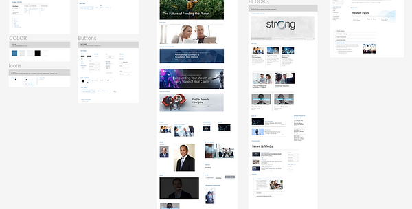
Oppenheimer.com, being a complex website with various page types, led me to focus on five pages: Homepage, Navigation Page, Wealth Management subpage, News and Media& Abou us.
We initially captured screenshots of unique components and encountered them to compile a comprehensive catalog. Simultaneously, in my Figma file, these screenshots are categorized as navigation, color, icons, typography, buttons, images, forms, blocks and interactive components. While further breaking into more components in later design. (cards, images, buttons, text fields, navigation, and icons, create a structured repository for these elements. )
Further exploration in distinct components
Further down the road, my team and I researched different pages to compare different patterns for in-depth component reconstruction. We noticed Oppenheimer has varied image sizes and there is no unified standard for it.
For example, the News& Media, Blocks and image cards are all horizontal images but with no exact aspect ratio for each, such inconsistencies will confuse users.
The UI inventory served as a reliable foundation for identifying the components we aimed to incorporate and revamp in our system.

What to be expected in UI Kits
-
Coherent Color, Typograph, Iconography and Layout
-
Standardized Accordion, Buttons, Cards, Check Boxes, Form Field, Navigation, Table and Text Link.
Building Consistent UI Kits
Methodology
We implemented atomic design principles to create components that are consistent, modular, and capable of scaling effectively.

Styles(Rock Atoms)
Initiating our design process, we laid the groundwork by meticulously selecting foundational elements encompassing color schemes, typographic styles, and layout arrangements. These core stylistic choices were instrumental in crafting the fundamental atoms of our design structure.


For example,
Establishing a cohesive layout framework and choosing appropriate typefaces played a crucial role in unifying our design system, contributing to a consistently styled and visually coherent interface. Additionally, we meticulously crafted spacing and layout guidelines throughout our interface, focusing on achieving a harmonious balance and a clear hierarchy, which guides the placement and arrangement of elements for an optimal user experience and visual structure.
Furthermore, we created fundamental 2:1 and 1:1 Aspect Ratio Elements to ensure the freedom of resizing. As for accessibility considerations, our distinct sizing options allow for flexibility and adaptability in various layout configurations, facilitating an intuitive content hierarchy.
Aspect Ratio

Molecules (Image Sizes)
From there, atoms are combined and image sizes of components are created for complex usage, which serves as molecules. We defined rules and usages of different sizes of image molecules to create more complex Organisms.

Connect Molecules to Organisms
We crafted our most sophisticated components by organizing atoms and molecules together. From there, our pre-selected and defined color schemes, typography, and layout all combined and looks consistent.
Eg. Card Components, are complex and overwhelming at first glance. Yet, employing atoms and molecules made our design process more efficient and at the same time, ensured consistency in design.

All elements combined together for further creating pages and templates
Document a Design System
Trust in investing, design as planned
In the initial stages of our design system documentation, we engaged in brainstorming for suitable names and core principles. "Oppenheimer Capital Canvas" emerged as the ideal choice, aligning well with the professionalism and trustworthy vibe of a finance company.
Moreover, we envisioned the name being cohesive, identifiable, efficient, and practical. Our guiding principles center around the user experience, underscoring our objective to elevate the overall experience of conducting financial decisions.
Our design system documentation can be found in Zeroheights.

A thorough and simplified system catering to the needs of users and stakeholders
In our documentation, we acquaint stakeholders with our system, its underlying principles, and design values.
They are then able to investigate our fundamental styles and components, familiarizing themselves with standard usage practices and various options, including plenty of variants of certain components.
Moreover, there is a contribution and contact page that welcomes input from the wider community.


Why should Oppenheimer Company adpot Oppenheimer Capital Canvas?
Its unified design simplifies user interactions on the website, while familiar interface elements enable quicker information retrieval.
Also, accessibility is a fundamental part of our design, enhancing the browsing and locating information experience for more users.
Moreover, the design system facilitates the rapid development of new solutions using existing principles, guidelines and components, thereby shortening development cycles.
It saves designers, and developers tons of time to focus on new ideas instead of repetitive issues.

Final Thoughts
Key Takeaways
-
Learned considerable knowledge in developing components and variants, along with utilizing auto-layout in Figma. Since I have not used many of these features, it has been an excellent chance to enhance my design abilities.
-
Furthermore, I learned that effective communication is crucial for efficient work, and prioritizing emotional management is an important insight, especially when dealing with frequent differences in design ideas. I committed myself to handling my teammates' expectations and emotions, ensuring I remained responsive and proactive to maintain alignment throughout the project.
